TLDR: Just show me the design already.
As someone who comes from a graphic design background, I like to look at different things and think to myself, how would I handle this? What would be the guidelines on if I worked on that project?
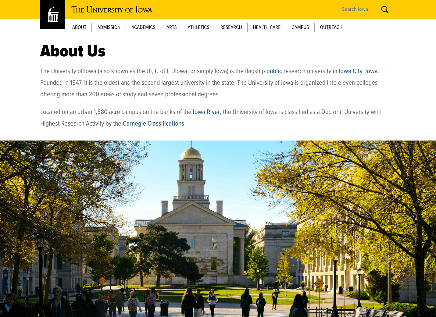
One of those designs I’ve considered over the years is the University of Iowa home page. I’m not involved in the UI home page in any manner and this wasn’t something I was asked to consider.
Any time a designer works on a high-profile project, it can be a pretty thankless task—especially on the web. There is bound to be a portion of the audience that doesn’t like what you did. Or you might have technical requirements that make what you’d prefer impossible. Finally, even great designs tend to age very quickly. A site that was designed five years ago might have looked great when launched, but looks dated now. I recall thinking it was a huge upgrade when the current UI home page was launched several years ago.
None of this is intended to be a slight to anyone who worked on that design or might be working on a new design.
However, if I had full autonomy on that project, these are the guiding principles I would want to follow:
Discovery Phase
Since I’m not required to communicate these ideas to anyone, it’s pretty easy compared to most projects! I get to pick my own priorities. And they are:
- Fun, energetic
- Welcoming
- Warm and colorful
- Modern feel
- Use of beautiful photography, which the UI has access to with photographers on staff
- Keep most content and menus similar to the current site.*
* I didn’t want to change this too much and this is one of the main things that was carried over from the current design. I know what a struggle it can be to limit the number of navigation links, so it seemed like a cop out to just eliminate anything I didn’t think was important. There is someone who thinks that all those links should probably be more prominent than they are, and a battle could result over any one that is removed.
Color Analysis (Black and Gold)
The University of Iowa, like most colleges and universities, has two main colors. They are the unfortunate combination of black and gold. And unless you are a bee or wasp, each of these tend to have issues.
I’ll tackle issues with black first.
Black can be a real problem on the web. It can be overpowering when not handled correctly. Just do a Google search for “using black on websites” and you’ll find all sorts of articles about this problem. So instead of using pure black, I tend to prefer using a dark grey. Also, I just don’t like huge fields of black. I’ll talk more about why when I get all touchy-feely and talk about “feelings” in a little bit.
The next issue is gold.
After being in the Iowa City area for quite a while, I’m pretty used to seeing gold everywhere and might be a bit desensitized to it. But I remember at first thinking the use of gold/yellow was just overwhelming. And I think most non-locals feel the same way. A little goes a long way.
My main goal with using black was to use it sparingly and not use pure black. I’d try to use grey or some sort of mix of grey in a pattern.
For gold, I strongly believe that gold is the University of Iowa’s primary color. It is a bright and warm shade and can carry the feeling I want the site to express. But it has to be used carefully. Overuse can be just as bad as using black.
I did a bit of research on other schools who had black or gold as one of their two colors as well. The list of those schools is below.
| School | Color One | Color Two | Color Three |
|---|---|---|---|
| University of Iowa | Black | Gold | |
| Purdue University | Black | Old Gold | |
| Vanderbilt University | Black | Gold | |
| Harvard University | Crimson | Black | |
| University of Missouri | Black | Gold | |
| Northern Illinois University | Black | Cardinal | |
| Oklahoma State University | Black | Orange | |
| Providence College | Black | Silver | White |
| University of South Carolina | Black | Garnet | |
| Texas Tech University | Black | Scarlet | |
| Wake Forest Unviersity | Black | Old Gold | |
| University of Colorado Boulder | Black | Gold | |
| Georgia Tech | Black | Gold | |
| University of Idaho | Gold | Black | |
| University of Georgia | Black | Red | |
| University of California Los Angeles (UCLA) | UCLA Blue | UCLA Gold | |
| University of Maryland | Black | Red | Gold |
| Arizona State University | Maroon | Gold | |
| Iowa State University | Gold | Cardinal | |
| University of Wyoming | Brown | Gold |
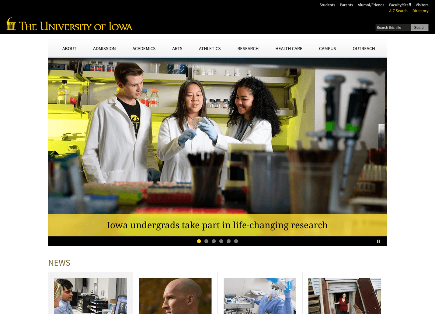
The UI’s home page relies heavily on black as its primary color, which I think is problematic. If the site was for the football team and the designers wished to convey a tough and mean image, I think an abundance of black is acceptable. But my goal for the UI brand would be bright and welcoming. I’d want it to be fun and energetic.
With sparse use of both of the main colors, I would recommend using bright, colorful photography as the main source of color.
I can go on about color theory or other branding guidelines, but I’m hoping to keep this (relatively) short and sweet, so I’ll leave it here.
The New Design
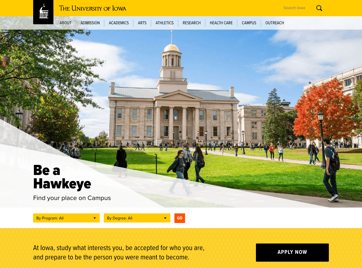
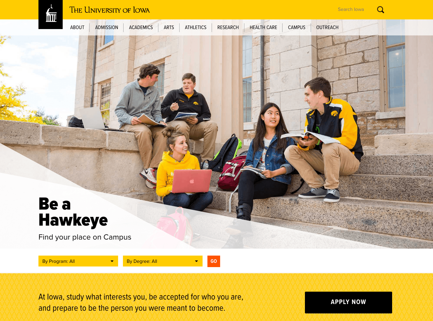
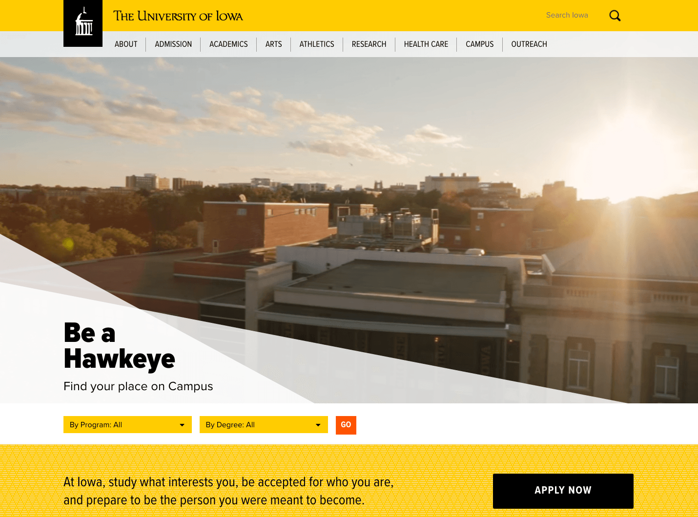
I find I get into discussions about design theory and reasons I would recommend changing one thing or another and I don’t think it’s as impactful as actually showing what I mean. With that in mind, I have created a functional UI Home page that demonstrates these guidelines. I have made three variations of the new design. Links and details are below.
Option One: Static “Hero” Image
Option Two: Muiti-Image Slideshow
Option Three: Looping Video
Interior Sample Page
Disclaimers
Logos, trademarks, images, etc. are owned by the appropriate entity. Mostly the University of Iowa. This is a personal design project, not intended to harm or infringe on anyone. Please don’t sue me.
These designs are built to be fully responsive on mobile devices. They have not been coded in Drupal 8. Doing so just seemed like a waste of time and a bit of overkill.
Also, I’m not a fan of looping videos on home pages. There are issues with when it will work without all browsers supporting automatic play on them now. I still come from a time when not everyone had broadband, so there are delay issues I’d be concerned with if all your target audience won’t mind loading even a short and lower resolution version. Selection and use seem to not always be well thought out either. I’ve seen some examples that feel like they are intended to trigger a seizure rather than leave a positive impression on visitors. To me, it feels like the flavor of the week in current design trends. But that is a topic I can spend a whole other blog post on. I wanted the focus to be on the design overall, not on particular design features. I wanted to present it with some options, so any criticism would be made on my main points, not on the lack of something like a looping video.
Summary
Ultimately, this is just a personal project. Simply a creative outlet. It’s not intended to criticize anyone, but something I think can provoke thoughts about the important role design plays in any project. Websites can be very technical things and striving for a beautiful design can often be an after-thought—if it is considered at all—during the development process.
It is so easy to create a “good looking” website now. There are tons of WordPress themes that can get you most of the way there now too. It’s common to see someone throw stock photos into a template, slap on the company logo and call it good. Each element should be considered both individually and as part of the whole. Design shouldn’t be the only driving force. If a site isn’t well-designed technically, it can suffer just as much. User Experience. Responsive design. Navigation. Accessibility. Search Engine Optimization. These aspects are all just as important. And for a layperson, these can be hidden, or not as obvious.
Even if a visitor cannot express it in words, there is a feeling that people get when they see beautiful design compared to something “slapped together.” It’s something that can be felt, that careful consideration was given to every element, how it relates to other elements and how they all work together for a final design.
William Easton
November, 2018

